Post provided by SHAWN LAFFAN and ANDREW THORNHILL

Phylodiversity indices are increasingly used in spatial analyses of biodiversity, driven largely by the increased availability of phylogenetic trees and the tools to analyse them. Such analyses are integral to understanding evolutionary history and deciding where to allocate conservation resources.
Phylogenetic Indices: The Current Favourites
The most commonly used phylogenetic index is Faith’s Phylogenetic Diversity (PD; Faith 1992). PD is the phylogenetic analogue of taxon richness and is expressed as the number of tree units which are found in a sample.
More recently developed phylodiversity indices adapt the calculation of PD by adjusting the branch lengths of a sample using the local lineage range sizes and abundances, for example Phylogenetic Endemism (PE) and Abundance weighted Evolutionary Diversity (AEDt). In PE the length of each branch in a sample is multiplied by the fraction of its total geographic range found in that sample. The AEDt index uses the same general approach, but weights each branch by the fraction of total abundances found in the sample. The weighting process is generic, so one can scale the branch lengths by any relevant factor, for example the threat status (Faith 2015).
Compound indices can also be developed. For example, the CANAPE method uses PE with a randomisation test to identify areas of old and new phylogenetic endemism or areas that are museums or cradles of diversity (Mishler et al. 2014).
There are also measures of turnover, where one is interested in how much of the tree is shared between two regions, and how much is found in one but not the other. The comparative regions might be individual cells, aggregates of cells, polygons or some other unit of analysis (such as time periods). Turnover indices like these have long been used in biogeography and ecology. The phylogenetic variants simply enumerate units of branches, rather than some taxonomic level such as species. This applies to any measure, including the range weighted indices of turnover described in Laffan et al. (2016).
Understanding the Results
A key problem, though, is understanding how these indices were calculated for a given location when you have a map with hundreds to thousands of locations (typically cells), using a tree which contains 60,000 or more branches. Were the results driven largely by one clade? Or were they due to a taxa spread across the tree?
If you’re using a command line interface then you could write code to extract the relevant subsets of a tree given the set of terminal that occur in a location. Unless this is automated in a script though, it can result in considerable typing and, inevitably, errors associated with that process. It’s far more efficient to automate the whole process, and this is exactly what Biodiverse does.
Biodiverse: The Basics
Biodiverse is a tool to analyse and visualise the variation of diversity across geographic and other spaces. It has two components: an analysis engine which can be called through scripts, and a Graphical User Interface (GUI) which sits on top of the engine and provides a simple interface for the user to interact with their data. The system is written in a way that allows the easy addition of new indices. It currently supports more than 330 indices of diversity for taxon, phylogenetic, functional and environmental inputs.
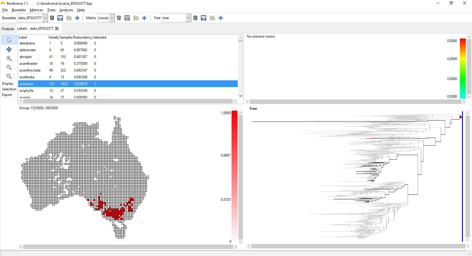
The interactive visualisation of phylogenies with associated spatial data has been part of the GUI since it was originally developed. In recent versions though, you can plot the tree in a different window, alongside the analysis results. In this approach you can hover the mouse over any location and the branches found in that cell will be highlighted on the phylogeny. You can also hover the mouse over a branch in the phylogeny and see where that branch is found in the spatial data. Lists of other important and interesting information can be found by control-clicking on a cell or a branch. Helpfully, right clicking holds the currently highlighted patterns constant until you’re ready to move on.
What can I Learn from Biodiverse?
Usually when you’ve calculated some indices of phylogenetic turnover then you’re going to be interested in finding out which set of branches is common to two regions, the set found only in the first region but not the second and vice versa. This will help explain the observed patterns and ask further questions such as which lineages are driving the results.
The screenshots below show the rate of phylogenetic range weighted turnover (described in Laffan et al. 2016), using the Acacia data used in that paper. This is for an index cell in south-west Western Australia (plotted in grey), a zone of high Acacia phylogenetic and species endemism (see González-Orozco et al. 2011 and Mishler et al. 2014). See Laffan (2011) for more details about how this interactive process works.
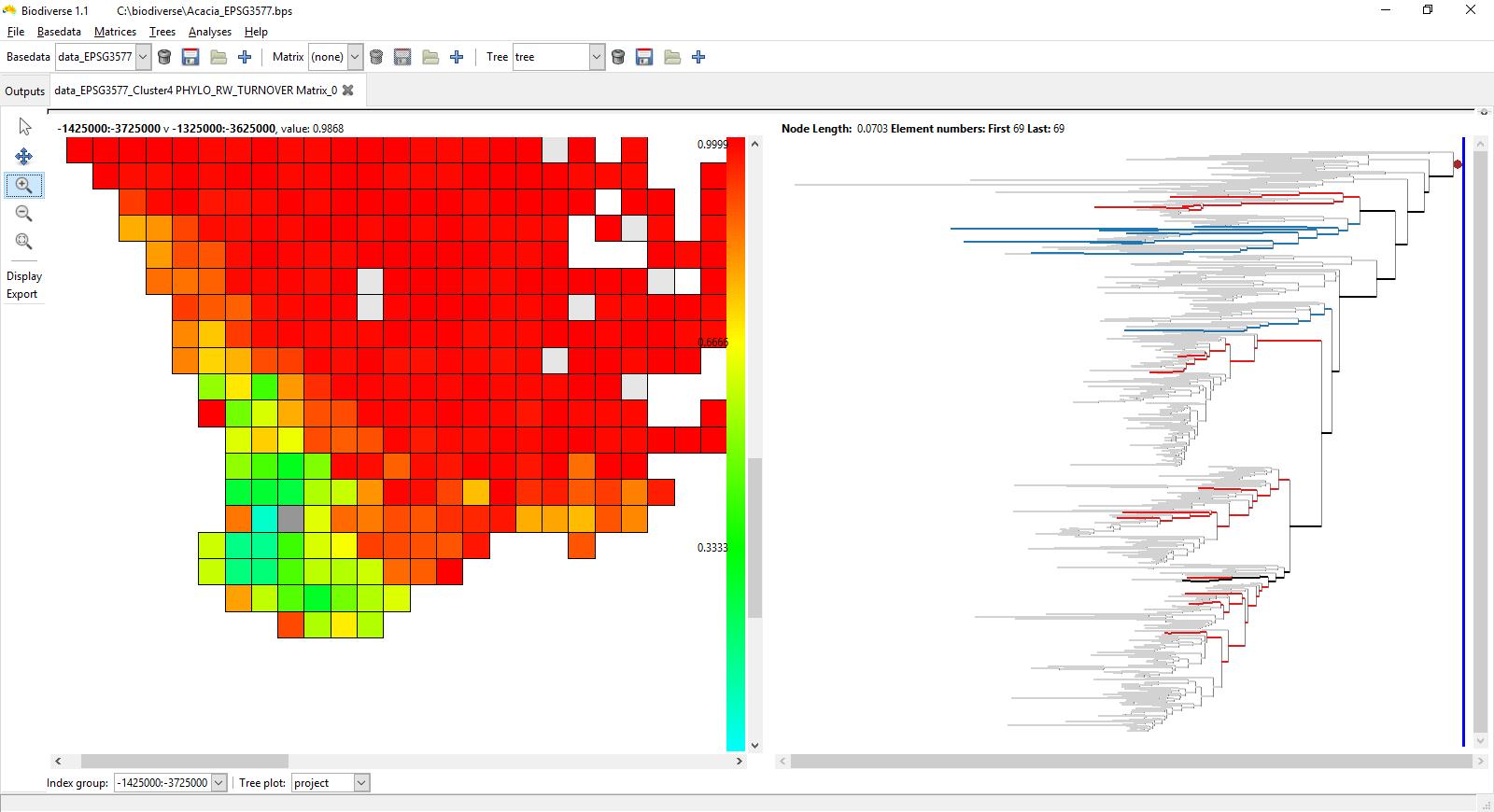
Red cells have high turnover compared to the selected index cell, while those in the green and blue have low turnover.
The branches on the tree that are highlighted are those in the index cell and a cell that was hovered over when the screenshot was taken. Branches plotted in blue are found only in the index cell, those in red are found only in the cell being hovered over. The branches in black are found in both neighbour cells. Any branch not found in the two cells is in grey to reduce its visual impact without hiding it.
The first screenshot shows the set of branches in the index cell (coloured in grey) and the cell immediately above it. There is low phylogenetic range weighted turnover between these two cells, and you can see why given the number of branches in the tree highlighted in black, most of which are part of the same clade. The tree has just one blue lineage and two red lineages.

On the second plot the highlighted branches are for the cell two cells to the right and two cells up from the index cell. This one has high phylogenetic range-weighted turnover. Now the black branches of the first plot are in blue, so they are found only in the index cell. There are also more red branches from across the tree, so much of the turnover is due to additional branches found in the hovered cell and not the index cell. There is very little that is shared (black branches) except for some higher in the tree. These are actually quite widespread, so will have only a small influence over the range-weighted turnover score.
You’re not restricted to plotting the tree used in the analysis. Using the drop-down menu at the bottom of the window you can select from the analysis tree, the currently selected project tree, or no tree at all. In this way you’re able to explore the patterns of diversity against several alternate trees.
If you want to know which species or taxa the branches are related to, then Biodiverse allows you to control-click on the branches to identify which species they represent.
Looking Forward
We’re working on a future version of Biodiverse which will also rescale the tree as you hover over the cells. This will give you the ability to see the effect of the weighting factors used in PE and the other indices listed above.
More Information
Biodiverse is free, open source software. For more details about it and to download it, see http://purl.org/biodiverse
To see what else Biodiverse has been used for, click HERE and HERE.
To find out more about phylogenetic turnover and range-weighted metrics of species, read the full Laffan et al. article HERE.
This manuscript is being highlighted as part of our promotion of Southern Hemisphere authors coinciding with the 8th Southern Connection Congress in Chile (18-23 January 2016). Follow us on Twitter, Facebook and Google+ to see other great articles that we’re highlighting this week!

One thought on “Introducing Biodiverse: Phylodiversity Made Easy”