Post provided by Mateusz Iskrzyński
Would you like to quickly get a clear picture of the food web you are modelling or analysing? Have you thought about including its visualisation in your paper? Or maybe you wanted to show your students or general audience how interconnected food webs are in real ecosystems? Or just wondered how matter flows through an ecosystem?

To help you with this, Mateusz Iskrzyński and Łukasz Pawluczuk have developed an open-source Python package featured in their recently published Methods in Ecology and Evolution paper ‘Food web visualisation: Heat map, interactive graph and animated flow network’. This package provides a few mutually complementary food web visualisation methods: a heat map, an interactive graph and an animated flow network, using colours, sizes, positions, zoom and movement for precise identification of flows, their magnitudes and connectivity patterns. In this post, Mateusz describes the ensemble of mutually complementary visualisation methods that enable a general overview of food webs within an ecosystem.
What does a food web look like?
Field ecologists and modellers painstakingly reconstruct who eats whom and how much in an ecosystem. The produced food web is a weighted network that typically has tens of nodes connected with flows that can differ by up to ten orders of magnitude. The actual flow values really matter for many food web properties, such as cycling of matter in ecosystems. We were really surprised to observe no correlation between its unweighted simplification and the proper estimate.
When working with food web data we often lacked a satisfactory visualisation tool that would let us quickly see all the flow of matter while allowing an unambiguous identification of the nodes they connect. To date, there has been no open-source library drawing weighted food webs with fractional trophic levels clearly. The existing approaches are scattered across separate libraries and programming languages, and therefore they are challenging to use. They also miss a great opportunity to clearly display food webs.
Trophic level arrangement
Food webs are special. They are strongly hierarchical, which becomes apparent when nodes are aligned according to their trophic level. A particular type of food requires specialisation. Digestion of plants or detritus poses completely different challenges than carnivory. On top of this come the many orders of magnitude of organism sizes, leading to a ladder of ‘trophic layers’.
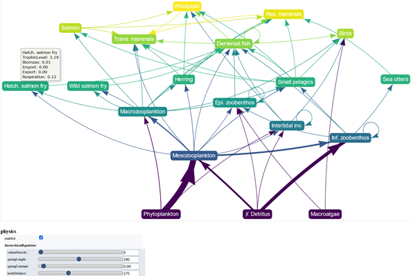
The simplest and also the traditional image of a food web maps trophic levels of nodes to their vertical positions. Our method creates an interactive graph that automatically optimises the horizontal positions of nodes. We gave users the opportunity to adjust the algorithm parameters or shift nodes manually. The width of arrows maps the flow magnitude. The node colour also encodes the trophic level. By hovering over a node, the user can display its basic properties. Selecting a node highlights all flows connected to it.
The strengths of an interactive graph come from allowing the viewer to trace the flow of matter over subsequent links. However, all living organisms die and become detritus, so omitting such flows for the purpose of this presentation has vastly improved clarity.
Heatmap for an unambiguous network flow identification
The inherent complexity of food webs makes them rarely easy to draw, as many consist of 50 or more nodes. In a graph it becomes tough to see which nodes are connected by a particular flow. A heat map of food web flows maps magnitudes of flows connecting a row to a column to colours of cells. It shows general patterns at a glance while retaining the precise identification of flows. The user can also display diet proportions or flows normalised to other quantities such as the biomass of their source etc. as well as switch roles of columns and rows.
Animation
Appealing particle flow animations, such as Windy, inspired us to present matter actually moving in a food web. The movement of particles helps to visually identify their source and target, granting an advantage over the conventional static representations. The density of particles encodes the food web flows, and node sizes map the biomass stocks.
Multiple perspectives forge a deeper understanding
We believe that combining multiple visualisation approaches can enhance the understanding of an ecosystem and provide more relevant representations for the broader public. Aesthetically appealing and clear images presenting empirical data help to communicate the importance of species interconnectedness and ecosystem complexity. We hope that our package will help to reach those goals with a minimum effort.
To read the full paper, ‘Food web visualisation: Heat map, interactive graph and animated flow network’, click here.
To watch the full YouTube video about Mateusz’s paper here.


